
rattleandburn
-
Posts
266 -
Joined
-
Last visited
-
Days Won
13
Content Type
Profiles
Forums
Gallery
Posts posted by rattleandburn
-
-
rolling in here with a super late reply....
Both my printers are borked at the moment, but I can send you the file if you want to Shapeways it - you can have them done in metal there too and its gorgeous -
Everyone's basically covered everything, but as we've seen the ranking scheme go is one uniform, two ranks (Lt./Capt, Major/Colonel, and now this as General/Admiral) and it uses the rank stripes given to us in the visual dictionary which clearly states the ranks. To be quite honest, this seems like a no-brainer. We know the rank stripes mean X, we have seen both on this uniform in film and promo images. Ergo, it is these ranks.
The issue here isn't with this black uniform and its associated ranks, the issue is that we have a 'generic general' wearing Hux's uniform that is now, due to information shown and given in TLJ, an incorrect anomaly - imo that's what needs looked at, asking sources for clarification if possible (is it a dress uniform?is Hux just special?) and a revision in name so that this uniform with reference can be given its due. If anything is getting a non-ranked uniform description title as a CRL, it should be the one without canon source. This Admiral/General has canon rank information -
They may not have to take it entirely apart; but will at least have to take out the lining, most likely. Its quite possible to get the majority dimensions and then do a little math and extrapolate a little.
There is a pretty good olive drab/field grey twill that JoAnn's carries now, but they carry it inconsistently and not at every store, mostly just their big ones that carry the broader suiting collection. I know @Tentayena ordered some off their site so he may remember its name or have the link, if you can get your hands on that its a good fabric and very inexpensive.
A couple notes on the ones you linked, since I have sampled them on my hunt for a consistent source. The TrimFabric one is gorgeous, very nice rich color, soft. It doesn't breathe well, as its full poly, and will pill beneath the armpits/belt and on the inner trouser legs after a few wears.
The Onlinefabricstore one; its a little bit too dark to be accurate. I have used it in red for Isard; fabric quality surprisingly nice for the price, but same as the above with the pilling and lack of breathability
The wool-poly blend from TrimFabric is a good quality fabric, has the right amount of natural fiber + manmade to be durable but not pill. Your mileage may vary on the color though, I thought it was too dark but thats just my opinion.Edit: forgot I'd posted about it on facebook, the SKU for buying online is 400157754977, and here's a relatively true to color image, although it reads a bit more grey in real life

- Tentayena and TwistedZen
-
 1
1
-
 1
1
-
4 hours ago, Governorpryce said:
Poor Vanya. More to make. lol
I so can't wait for this book and to meet Timothy again at Ad Astra in July.
don't call me out like this xD
-
Hold out for the last issue of the Thrawn comic where he'll be in the Grand Admiral uniform finally, and then come back and make your case with some lovely full 360' reference images
")
-
I'd definitely suggested seeking out a custom build or crow props. I have the ImperialBoots ones (bought them in the first wave) I can count on my fingers how many times i've worn them still; the zipper is broken, the soles are peeling off, the leather is cheap and scuffed through/can't be buffed out. Huge disappointment there; Gio at least uses nice leather on his builds.
-
-
Real late reply here, but; the alterations to Rebels Thrawn's uniform are not something CosplaySky has available but they're simple enough that most of the vendors who sell on Etsy or similar places making staff/line officers should be able to do if you give them the reference that shows where the new seams are. Its a pretty minor pattern alteration for someone who has already created the patterns and knows the standard variant.
Just show them ref like this (full color bottom version has the new seam variants), or the cg model's full turnaround image which you should be able to find just by searching "rebels thrawn model" or similar
-
You look great! Always good to see more Thrawns around

- Hask and Coldsteele
-
2
-
I appreciate your work and your committment to the community.
But can we not just deflect and put down literal existing evidence with "its CGI" when they most definitely did, in fact, film that scene in real time with real actors? If you dont like it, that's fine, but it exists, on screen, in canon. Its simply not an animation error, they included a split on the toy molds as well, which are made from 3D scans rendering people in the actual costume. It is simply there. I'll give the box pleat a hard maybe, you do you, but the split is there. Make it a TFA versus TLJ variant in the CRL if it matters that much to people, but its there and it can't just be denied as 'an error'
-
I have seen quite a few behind the scenes photos from Disney contacts that I can't share with anyone, but I tend not to bring them up in discussions like this as I really can't back up my points without sounding like i'm talking out my butt or getting a source in trouble. :/
That scene is part CGI, part not, so please don't poo-poo it by trying to say he was all animated, as that is just factually incorrect. -
8 minutes ago, Hask said:
The strap is there and its clear in the visual dictionary and the behind the scenes photos i have seen , im not sure who the majority is but for me personally I can see the box pleat it's very visible in TLJ and one scene in TFA Just the way the coat moves when he is walking shows there is no split as it bellows out like a cape, I feel both options should suffice
The way he walks and how it billows shows that it has a huge amount of volume and was likely draped on the diagonal for the flow, split center or not doesn't actually change that. In TLJ they changed the cut of his garment, so that it has sharper lines; he looks like an inverted triangle over a triangle with a very pinched waist. It flares with volume, and flows like a cape. Its construction based but whether it splits or not has little to no bearing on that form and function as mentioned above.
I dont have an issue with people wearing both, but the fact of the matter is we have video evidence that it splits. What is more logical and rational, that they made him two coats constructed entirely differently, or that it hangs shut most of the time because its heavy and made very well. -
^agree with Morti, mostly, but I just want to see more Thrawns.
The same cover artist did some preview images that were in the back of issue #1, and I think #2 as well (I don't have them on hand). I'd suggest finding the cover artist name for that variant and stalking them on Instagram or Twitter for progress photos, discarded alternates, etc to make up any more reference needed") Most of Marvel's artists are really into people cosplaying their work too, chances are if you send them a message about it, they'll share what they have if they have anything that would help! I'm all for it because we need more blueberries, if the ref is there
Most of Marvel's artists are really into people cosplaying their work too, chances are if you send them a message about it, they'll share what they have if they have anything that would help! I'm all for it because we need more blueberries, if the ref is there
No real reason there can't be the ISB flap style CRL when someone does it, AND your particular variant if the art is there. Options are good -
Its super not a box pleat, Hux just has only the one scene where he (or the wind) move it enough for it to be extremely visible, as it lies quite neatly otherwise. There's evidence for one (split) and not the other (pleat). CRLs should be based on what can be seen and proved; there's a couple of other things on Hux that everyone does when they create their costume, but are mostly just extrapolated from the grey uniforms that have the same construction, as we don't see it ON Hux due to shadows or wearing a coat, and thus no one's ever tried to even offer them as CRL edits.
-
1 hour ago, lantern2745 said:
Regarding the rank bars from the panels provided by @rattleandburn in the first page of this discussion - and forgive me if it has been mentioned already, but they're depicting both Thrawn and Vanto as having Blue over Red.
That's a new thing unto itself isn't it?
I'm of the belief that the comic version of the Line Officer uniform (field gray/green ISB) deserves it's own CRL.
I would put forward that it has the ISB front closure and no princess seams. Also that the rank bar worn with it be one of the configurations seen in the comic, NOT from the films or Legends sources.
The rank bars are definitely a colorist issue, it may be intentional or it may not, but I agree it should be worn as seen in the comic and also agree that it deserves its own CRL due to the variety of differences. The rank bar color thing has been seen before, in the old comics featuring Ysanne Isard - it was featured both red over blue and blue over red, internally consistent, in separate runs, while she was stated to have the same rank. Likely a colorist issue as well, but if its internally consistent within what you're costuming from then it likely should be matched for accuracy, rather than assumed incorrect.
3 hours ago, anthonyl31491 said:Like I said, I appreciate all the Information. I’m already well on the way to creating the uniform pictured in the cover art, as I perfer the realism of the cover art as opposed to the angular appearance of the hastily drawn frames.
As Hask has stated, some things are illustrated incorrectly. I agree. There is oversight by Disney, but at the same time, not everything is meticulously scrutinized, and some details are simply passed without a second glance.
Its ts all based on where the artist wants the focal point of the frame.
I just want to clarify that I am NOT intending to complain about any of your costuming plans here, i'm just talking comic differences so please don't feel i'm coming for your costume in any way, I'm just contributing to the continued discussion that evolved after your original post
There is quite a lot of review put into comic art before it is colored, given text, and printed, most of the review is to the panel art itself, which is why we see debatable stuff like the rank bar colors, that's a separate person. Its definitely not hastily drawn, however, its a long thought-out process with a lot of work. Luke Ross posts quite a lot of WIP of his process of sketches, revisions, inking, more revisions, etc to his work, and his choices in line art are definitely intended.
-
They regular moff'd his rank though. Its a preview image, so one or the other may be incorrect. Coloring is done by a separate person, Luke Ross who does the main art is not the colorist, so color tile inconsistency would lie elsewhere. The artist is responsible for the uniform design, which is the entire point of the post.
The point was ISB flap style tunic was from ranks A to B, normal style tunic is shown as Admiral, equivalent governor ranks.
There's really no need to derail 'these ranks wear X, these ranks wear Y, here is the consistency in images" because there's no little yellow tiles. That reaaaaally doesn't negate the information stated
-
guess we're not gonna address the tone, okay whatever.
'Yoke doesn't quite meet' imo is on the same level as they use black shading lines so they didn't do big harsh black lines for princess seams/arm seams, kind of shrug at it all. Its not on the same level as the ISB style flap tunics having a clear and consistent association with ranks and where the cut-off for the change is. -
A couple of notes, having read through this discussion.
Cover art has little to no bearing on the content of the book; they're done by guest artists who have a huge amount of leeway, and are often just for aesthetics, and each issue of Thrawn so far has had 1-3 variant covers. Marvel did a series of Variant covers about 1.5 years ago in homage to popular hip-hop album covers, using superheroes, doesn't mean Dr. Strange is canonically starting a rap career They're the comic equivalent of movie posters that take a lot of artistic license. So, uniform variance on a cover drawn by someone who has no other relation to the work and possibly hasn't even read it is iffy at best; comic cosplayers take that all with a grain of salt in regards to it being canon.
The ISB-style tunic flap is internally consistent on officers within the run, across a variety of ranks and jobs. Its especially noticeable on Eli and Thrawn as they're in the spotlight, up through issue three.
What's interesting to note, however, is Tarkin has a normal uniform type when he shows up. Thrawn has the different flap tunic, until he's promoted to Admiral, after which he has a standard tunic like Tarkin, as seen in previews for issue #4, while lower-ranked Eli still has the other style.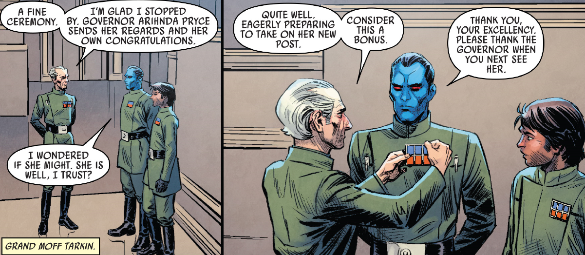
The consistently and use for certain ranks/characters definitely shows its not an art error of any kind, its a conscious design choice. (However I would easily accept the argument that the lack of princess seams on anybody is probably for easy of shading and not muddling the image with unnecessary lines, but they probably should be left out if its comic-variant, ISB-flap style, field grey uniform in the ranks we see in book)
and here again we see a room where everyone is Governor/Moff or Admiral rank, and they're standard
literally right before promotion, straight ISB style flap:
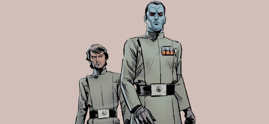
immediately after promotion: Eli in ISB style, Thrawn in new standard style: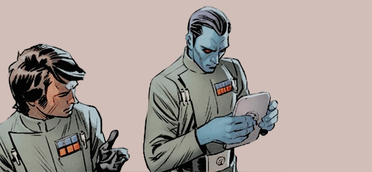
Its a deliberate choice by the art team, internally consistent within the run, so ideally a low-ranked Thrawn or any Eli Vanto should be wearing the IBS flap style line officer. An Admiral Thrawn should be in a standard uniform.
So, TL;DR here
A potential CRL for Comic Thrawn should feature ISB flap style uniform as pictured for ranks Lieutenant through Captain, Admiral rank should be applied to standard uniform style only. Big ???? on whether its worth picking over lack of princess/back arm seams, as no ones been up in arms about their non-existence in the past on other comic runs. Also I've messaged the artist about clarity on what ranks get what -
33 minutes ago, Tiogar said:
I phrased that poorly; I should have said it's my eventual goal to get that fit. lol
I'm going to have a full mock up done for an armor party tomorrow, and I'm hoping to build most if not all of it then. My plan is to have someone help me get the mock up fitting as well as can be expected, then cut it up and trace the pieces out. I've mostly done that once already, as standard patterns require some mods to fit well. It's gotten something pretty close, but it's hard to pin something you are wearing. I've had to do minor tailoring on shirts and light jackets before owing to my frame, but this is a few jumps past that. I'm hoping to improve it as I go. As long as it isn't a tent in some places or I'm not ripping seams in others, I'll be happy for the first go.
Excellent advise, thank you.
I was contemplating tearing into a suitcoat that doesn't fit anymore to see how it was built. lol So if I'm interpreting that correctly, I would use the ultrawheft or horse hair in most of the jacket (Chest back exct.) , and a heavy (but not ultra heavy) interfacing in the shoulder area? When you say cotton underlining, that is in addition to the normal smooth jacket lining?
After reading all this I think I have a few ideas on re-doing my Anakin surcoat. lol I double layered it and hate the way it moves now.
its a little different due to the shape of an imperial tunic, but this is a good breakdown of suiting interfacings/underlinings and the pros/cons of each https://blacklapel.com/thecompass/anatomy-of-a-suit-jacket-fused-vs-canvassed/
If you use a GOOD interfacing adhered properly, so, Ultra-weft or other strong woven one like shape-flex, and not those weird meshy ones that you can kind of pull apart, they are functionally as good as using a canvas or underlining technique, for a majority of cases, and for some fabric types is the better option. When I say cotton underlining, its a fabric attached and constructed with the outside. If your fabric has any stretch content, or distorts on the bias, or you have reason to believe it'll break down over time it may not be the best choice. If you use a firm cotton underlining, and your garment fabric distorts, you end up baggy and saggy in ways that can't be fixed. Different techniques for different fabrics and purposes, and different preferences.
here's a good explanation --> https://brooksann.com/sewing-underlining-1/
Tearing into a suitcoat is basically gonna give you one of the three info types shown at that first link^ and mostly what's relevant for imperials is shoulder structuring -
Getting that smooth and tight of a fit on your first suitcoat is a high bar, fitted tailoring is like its own stressful skillset within the broader skill of sewing. Do a lot of in progress fittings.
Pretty much any suitcoat that you buy off the rack is a light to mid weight fabric and has an underlayer, hair canvas, and interfacing to give it the structure needed. Sewing the whole garment in just the fabric will be too light, double layering it will be too thick and result in very bulky seams. A cotton underlining, Pellon ultra-weft interfacing (a modern non-mesh interfacing that is exclusively for this purpose) and a heavier sew-in interfacing to structure the shoulders is usually how it goes, but it depends on personal preference -
On 5/9/2018 at 9:21 AM, Tiogar said:
Hey all, back from a hiatus. Had to make other people's stuff for a while instead of mine. Lol
So ice got my pattern for my GA tunic. Should I do 2 layers of the suiting materiel and one of lining? Or is one layer of suiting good?
Sewing up my muslin tonight, hopefully I'll have pics. I want to submit by next Wed. Lol
Your suiting should be reasonably opaque and heavy enough as is, if not then the fabric is more lightweight than it should be, but not a problem. If it needs weight, you'd ideally want and underlining layer rather than double layering the actual suiting, or an interfacing specifically meant for suiting
-
As far as what was screen used, its definitely been multiple specific fabrics over the years, since the uniform type is in action from the start and again recently in Rogue One with freshly made costumes.
A wool or wool-blend midweight gabardine suiting fabric is pretty basic and easy to find, JoAnn fabrics is hit or miss on availability and quality, but Fabric.com, MoodFabrics, etc. online will have a lot of acceptable options of the right weave and most accurate fiber content, you might just have to swatch them to make sure you like the tone of black. -
3 hours ago, Coldsteele said:
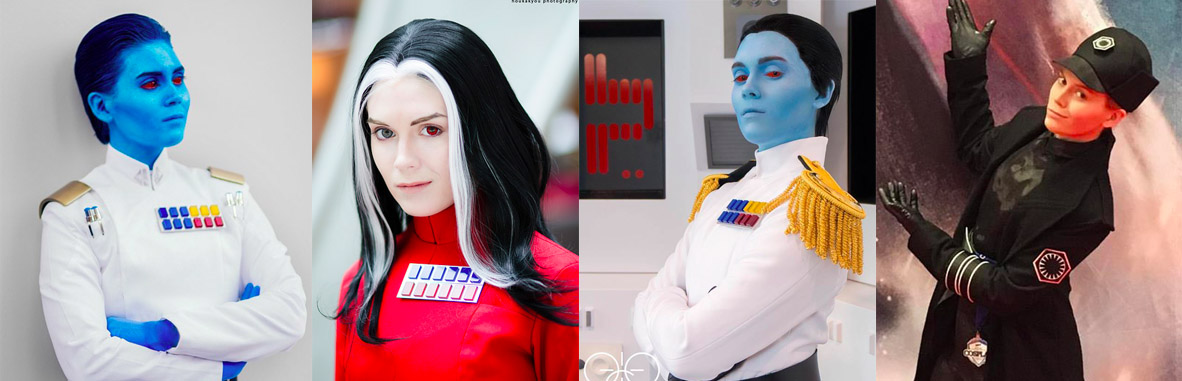
Thanks for putting up this great list , I’ll be taking some pointers from it for sure for my Rebels Thrawn. I’ve already had a go with Mehron liquid face paint and sealer with good success
Sent from my iPhone using Tapatalkdo you contour? My experience with the liquid mehron is it likes to flake off it you try to blend over top of it, but that is somewhat dependant on skin type and primer Report back if you have pics! It'd be great to get people to post here a face shot and what products they used so people can see them used on others
-
10 hours ago, Mitthrawnuruodo said:
I have a variety of alien X-Wing pilots (Mirialian, Zeltron, Pantoran, and Chiss for now) and I use Wolfe brand paint for all of them. Very easy to get, easy to apply and remove. Minimal amount of rub off (mainly around my lips)
I'm glad Wolfe works for you, those who have a good response to i tend to like it. Unfortunately its lack of inclusion on the list was intentional due to the large swathes of people who it makes break out, its suprisingly volatile to a lot of skin types

Thrawn pieces question
in Rebels
Posted
I'll share a google drive link here in the morning! all my 3D files are on my desktop computer and I'm not at home")